SIZE
For the size of the publication, I looked at notebooks in shops and noted down a range of sizes that I thought would be appropriate and nice to work with. I only chose portrait publications because it's traditional.
14.5x21cm
9x12.5cm
17x23cm
I liked the size of the 17x23cm notebook because it had more room on the pages, however I think it will be too big to carry around, especially if I hand it to a potential client. Decided on 14.5x21cm because it leaves enough room for note taking and also sketches which will be appropriate for my target audience. It is also just an A4 page folded in half which will make my notebook cheaper and easier to reproduce.
(I may need to add on 0.5cm - 1cm to compensate for the fold)
STOCK
Gsm of stock can't be too large otherwise the pages won't fold completely and the publication won't stay closed. I used influences from my research into publications and visiting shops such as Village to choose the stock. Around 120gsm will be appropriate because it's thin enough to fold and bend yet still feels tactile and quality. A slightly textured paper can make my notebook even more tactile and benefit the target audience when sketching/painting.
Visited Fred Aldous to look for stock and found a large range of G.S Smith stock. The variety of colours and weights make the shop convenient for any brief. I chose a range of primary colours because I want to create simple, friendly and complimentary colour schemes inspired by my Design Principles - Studio Brief 01:
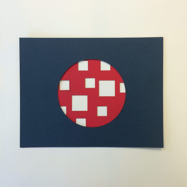
Design companies and studios get a lot emails and business cards everyday from designers wanting an internship or placement. In order for my notebook to stand out over the rest of the designers, I have decided to take advantage of the pages and cut into them to create an engaging and expressive cover.
Experimentation:
Wanted to use inspiration from the symbol I created because the geometric shapes and lines will translate well into this technique. This is an engaging way to add colour, rather than digitally printing out flat compositions.
As my stock was expensive I used plain A4 paper to work out how I can make my cover as engaging and impactful as I can.
When the notebook is opened the target audience will see how I have used negative space to combine colours and shapes harmoniously. This will make the client see how innovative and expressive I can be with a simple notebook.
I created a margin by enlarging the cover which holds together the pages that create the layered effect. This makes the notebook practical as the owner won't have to flick through 4-5 pages before getting to the white, blank pages:
LETTERPRESS CONCEPT
To add typographic content I aim to use letterpress to set the type and then print directly into my publication. I will need to make sure I align the page with the text accurately. This adds another analogue technique.
Repeated my name using demo letter press:
Repeated my name and faded it out which will make my name memorable but it also takes advantage of the printing technique, making my publication more engaging.
Using another analogue process will reflect my style of practice to the client as they'll be able to see the print texture. This will look more personal and takes advantage of different techniques and processes, instead of limiting myself on Illustrator or Photoshop.
I had already stitched my publication together which meant I had a very narrow window between the margin and the next page.
Needed to be clean and clinical so created a registration sheet. This was influenced by my screen print induction.
Provided my name and contact information:
Chose Clarendon 18pt because it's a traditional serif typeface that prints consistently - This is appropriate for the traditional analogue technique.
Printing straight into my publication was a mistake because I didn't press it properly as I was too conscious of making a mess of the book. In the end I still managed to make a mess of the book. This is all part of the learning process as mistakes provide better experiences, especially at this stage of my design journey.


No comments:
Post a Comment