Tour posters
Selling prints
The band contacted me through Instagram.
To begin with they asked for an EP cover for their latest single.
We organised a meeting in Manchester to discuss what the band wanted and the styles of artwork that they are looking for.
However they then asked if they could have an EP cover, a 4 minute stop motion music video, tour posters, t shirts and social media posts.
This was a great opportunity to experience design for music in the real world. I decided to work alongside Connor Hastie as a collaborative opportunity as we both have a passion for traditional print and similar tastes in music.
This now became a collaborative project.
Screen print:
Prepared some screen prints to sell at the gig:
Liased with the band to sort out printing costs and deadlines for the digitally printed tour poster:
Liaising with Connor about design ideas and decisions was made easier by email, however a more direct approach through phone or face to face would have been more efficient.
It was hard to get feedback from the band. I sent over designs via email, facebook and wetransfer.
EP Launch:
Attended the EP launch and set up a stall with both mine and Connor's prints on display.
Tried to think of something unique that I could do at the gig to celebrate the band and my artwork. To achieve this, I used
Liaising with Connor about design ideas and decisions was made easier by email, however a more direct approach through phone or face to face would have been more efficient.
It was hard to get feedback from the band. I sent over designs via email, facebook and wetransfer.
Single cover - KnewToo
Head of the band sent me the lyrics and overall theme of the single:
- Alienation
- The band have asked that I keep the lyrics secret therefore I can't publish them on my blog
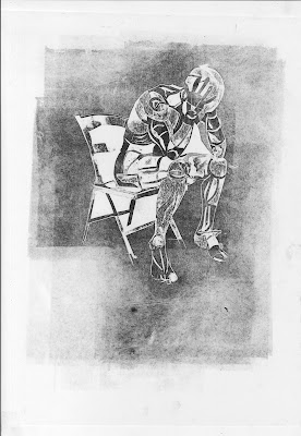
I called up Tommy Deedigan, lead singer of the band and we discussed some concepts. We both liked the idea of someone sat in a chair with their head in their hands
Sourced some stock images of a figure sat in a chair:
Previously used card printing for the 'Opinionated' EP cover therefore to keep the visual identity consistent, I aim to create a card print of the figure sat in the chair. Card printing is really good for lifting subtle tones which defines shapes.
Drew the design onto mount board and used a scalpel to cut the figure and chair out. In order to add detail, I took a layer off the card in order to lower the surface and produce tone - The more layers removed, the lighter the tone.
I referred to the original photo in order to show the perspective of light and highlight tones on the clothing / muscle definition:
Printing -
As I was inking up the plate, the sticky ink started to pull off fragile elements of the design. In the future, I intend to run the plate through the press without any ink in order to press the design and cement it.
Scanned the composition in order to see how if it would work on a square format and to experiment with type:
Digitally manipulating the print allowed me to adjust the scale and crop the image:
1: Enlarging the image highlights the details and textures created by the relief.
The abstraction of the human form makes the composition more ambiguous and engaging.
2: Graphic flack created by the ink roller:
from previous experience, digitally printing this graphic flack can be problematic.
3: Taking advantage of the negative space in order to bring all attention onto the figure.
Used Photoshop to invert the image:
Transferred the files over to the band in search for feedback and critique.
The band preferred this composition however they wanted handwritten type:
However I explained it would be hard to apply type to due to the fuzzy monochromatic textures. I also thought the composition wasn't unclear and the figure was lost from the cropping therefore I suggested an alternative composition.
I listened to the feedback from the band and offered an alternative. I compensated the design with the written type:
Hasn't been an entirely positive experience.
Hard to get people to choose the best design - Have to justify it and put your foot down.
This was probably due to lack of professionalism at the start which didn't set a good platform.
Learnt from my mistakes


No comments:
Post a Comment