Reflecting on where I was at the started the course to now, I feel more confident as I have identified artists, designers and studios that relate to my practice. PPP encouraged me to explore all areas of design and focus on what makes happy. This was refreshing as it made me put my own personal interests into my briefs. I can now follow blogs and studios such as Hey, People of Print, Heretic and It's Nice That for inspiration and to also stat up to date with creative news. People of Print and Jealous are really useful sites because they provide continuous inspiration.
Writing my COP essay has been really beneficial because I am writing about the role of print media in the digital age. This is a topic that I have a passion for. I have discovered publications such as Print Isn't Dead which I have used as a source in my essay and also to inspire my work. Without reflecting on my practice, I wouldn't have found these websites and publications that I use to inspire my work and shape me as a designer.
PPP made me think about my future as a designer and I am glad I made the most of this opportunity because I have more direction and aspirations. I would like to go back to Berlin and Copenhagen because I have identified studios such as Gloria Glitzer that I want to visit. It would be a really enjoyable and beneficial experience if I was to visit these international studios because I can see different studio environments.
My confidence has grown throughout the course because I have found designers and studios that use analogue processes. Their outcomes are not always completely refined which makes them tactile, engaging and personal. I found that modernist design was useful for learning design principles but I want to start pushing the boundaries to create contemporary outcomes. It's important that I do this when appropriate.
I noticed that a lot of designers rely on social events such as exhibition launches to network. I want to attend more of these events and be confident enough to approach designers that I appreciate and talk to them about there practice. In the long run this will build my confidence and open up more opportunities in the future.
My time management will need to improve because analogue techniques often take much longer than digital outcomes. This means I need to start planning at least a week ahead. I find blogging useful for planning because it makes me reflect on my progress and discover any problems that I may come across before they happen. As I progress into Level 5 I will need to be more proactive in order to produce a large body of work and gain a lot of experience using different techniques and processes. This will benefit me in the future as I will be confident going into a studio such as People of Print and We Make and using/interacting with other artists.
Thursday, 17 March 2016
Research Methods
Using the library resources is a lot more reliable as the information is accurate and goes into a lot more depth. Using the internet is easy, however the content isn't trustworthy (unless it is an official site). I aim to use more research techniques like the library so that I can create deeper concepts which will benefit my work.
For the License To Print Money brief, I used library resources to find publications about the subject of money in a design context. I discovered Money - A History by Catherine Eagleton and Jonathan Williams. This publication was really beneficial to me because all the content is relevant and goes into a lot of depth. This has benefited my idea generation.
For the License To Print Money brief, I used library resources to find publications about the subject of money in a design context. I discovered Money - A History by Catherine Eagleton and Jonathan Williams. This publication was really beneficial to me because all the content is relevant and goes into a lot of depth. This has benefited my idea generation.
Wednesday, 16 March 2016
Self Branding 1.9
Self Branding Evaluation
Branding myself to effectively communicates me as a designer was a daunting prospect at the start of the brief because I hadn't established a style and direction in graphic design. However blogging for Studio Brief 01 really helped ground myself and encouraged me to think about what I enjoy and my main influences in art and design. During this process I have found numerous blogs, artists and designers that I have used to inspire my work during this year. Researching and discovering design studios that relate to me was encouraging because I could see people with the same perspective of design as me.
I chose to create a notebook for my self branding because I wanted to create something that I was proud of and reflected me as a designer. Researching into Aaron Draplin influenced this because it made me step away from creating a generic business card. This meant adapting techniques that i’d previously explored to create a book cover that reflects me as a designer yet still has a purpose as a
sketch/notebook. I am aware that studios and designers get emails and phone calls everyday from people like me asking for an internship or placement and there work is probably at a better standard so I aimed to make my design unique.
I gained an interest and passion for publication design and contemporary graphics because it is a satisfying and rewarding process that has many variables that can be changed. Sagmeister and Walsh's cover for their publication was really inspiring because it’s an example of how a book can be adapted to be interactive. By simply cutting into the cover meant the page could be adapted, making it engaging and visually stimulating. I spotted that Gestalt Principles could be translated into graphic compositions, especially the basic geometric examples. Predominantly using educational internet sources was useful because it provided simple and basic explanations and examples, perfect for the task. Reflecting on the project, I should have made the publication bigger so I could go into more detail and focused more on the typesetting. I aim to use more than just internet sources because the information can be unreliable. Sourcing books from the library on the subject would allow me to go into greater depth.
People of Print was really beneficial because it provides me with a continuous source of print media inspiration. I found designers and studios that used analogue techniques instead of digital. This was refreshing and encouraging because I now have a reliable source of inspiration. I have identified the studios and designers that I want to send my notebooks to in hope of getting a response. This would be a great achievement.
Layering coloured stock was influenced by my design principles publication as I discovered I could create graphic art. Using vibrant primary colours meant I could use a colour palette influenced by Matisse, this was really useful when I was choosing what colours to overlap in combination with the negative space. Considering practicality as well as purpose helped me to refine my outcome, for example adding the 6cm to the cover meant I could tuck the coloured pages in which makes it easier to get to the white stock used for note taking and sketching. Discovering Yunma Design’s notebook made me think about the purpose of my self branding which forced me to push my ideas further than just a simple notebook. If I had more time I would have liked to have been more expressive with the pages inside the notebook by adding images, textures and grids as this will stimulate creativity for the user and is unique.
I decided to create a series of symbols inside a box using a transferrable technique that weren’t consistent because I haven’t settled on a specific style or direction. These publications will be appropriate to send to a diverse range of design studios.
I would like to collaborate with other designers that use different media to me such as photography and illustration as that will open more opportunities and allow me to gain experience working with other creatives.
I would like to collaborate with other designers that use different media to me such as photography and illustration as that will open more opportunities and allow me to gain experience working with other creatives.
Overall I am pleased with how my concept developed from a digital grid system into an analogue promotion notebook that I feel confident to send to studios and designers such as Gloria Glitzer Heretic and People of Print to show my appreciation of their practice to hopefully build a design relationship. PPP has made me focus and think about my future in graphic design which I am grateful for because I can now begin to make connections and relationships with other designers and studios which could lead to more opportunities in the future.
PPP Presentation 1.2
Creating the presentation helped me to justify my interest in art and design. I wanted it to be visual so that the audience has some context alongside what I am saying. The images will also act as visual cues:

Bath College:
-Large range of techniques and processes
-Allowed me to specialise
-Increased my skill set

Found myself naturally creating graphic outcomes:

Attack my briefs as a problem and give the outcome a purpose/use.


Exploring more techniques benefits my work:


PPP encouraged me to put my work online:

-Print media
-Analogue
-Lots of updates and news about print

Colour and shape:

Shows I can be unique
Analogue techniques
Appropriate to send to design companies
Proud to send them

Unique:
Aims for next year:

Gloria Glitzer
"Art shows come and go, but books stay around for years. They are works themselves, not reproductions of works. Books are the best medium of works. Books are the best medium for many artists working today."
http://tumblr.we-make.it/
http://gloriaglitzer.tictail.com/products


Gloria Glitzer create publications to present art, graphics and illustration in a bespoke and personal way. They are often very short but are inspiring when printed on quality stock. They push the boundaries of what a publication can do.
Example of Stefanie Leinhos' contribution:

Visual content covers entire double page spreads. The zines often have no type at all, just contemporary and graphic art which can be used to inspire. The publications are also tactile which gives a sense of ownership if someone received it, instead of seeing it on a digital screen.
The studio creates a limited amount of publications that are often very small and personal. I would like to take their concept further by creating larger and more unique publications using bespoke media such as print.
Tuesday, 15 March 2016
David Wolske
Wolske is a letterpress artist who uses the traditional process to create clean contemporary artwork and graphic design.


Wolske has cropped the letterforms and layered each component to create contrasting, high impact compositions. He uses monochromatic colour schemes to create contrast which is also helped by the hard edges and angular lines. Wolske uses colour in a lot of his compositions which look like screen print outcomes as the layers of colour create more tones - CMYK:

Cropping the letterforms and layering them inside a confined area creates a lot of white space. This gives the composition a focal point. Wolske has used the negative space created by the geometric characters to make the type unrecognisable. I like how Wolske has used a traditional technique and created a contemporary outcome.
I would like to explore this printing technique and begin cropping down outcomes to produce more engaging and contemporary design. I aim to contact Wolske in appreciation of his work and to ask how he crops his prints so successfully.
Monday, 14 March 2016
Self Branding 1.7
Unstitched my publications so that I could letterpress my information onto a single piece of paper that can be cut down and create a page to be sewn back into the publication. This was a lot easier because the paper fit correctly into the press and I didn't have to worry about getting ink on the rest of the publication.


Using letterpress adds another analogue technique so clients and studios can see that I am an original designer that uses traditional techniques and processes to create contemporary and innovative outcomes.
I aim to take these outcomes into the photography studio and use the light boxes to photograph them to a professional standard. This will allow me to post it on my Behance account.
Self Branding 1.6
In response to my feedback, I am going to aim to use strictly analogue techniques as this will reflect the techniques and processes I am strongly considering taking forward into second year.
SIZE
For the size of the publication, I looked at notebooks in shops and noted down a range of sizes that I thought would be appropriate and nice to work with. I only chose portrait publications because it's traditional.
I liked the size of the 17x23cm notebook because it had more room on the pages, however I think it will be too big to carry around, especially if I hand it to a potential client. Decided on 14.5x21cm because it leaves enough room for note taking and also sketches which will be appropriate for my target audience. It is also just an A4 page folded in half which will make my notebook cheaper and easier to reproduce.
(I may need to add on 0.5cm - 1cm to compensate for the fold)
STOCK
Gsm of stock can't be too large otherwise the pages won't fold completely and the publication won't stay closed. I used influences from my research into publications and visiting shops such as Village to choose the stock. Around 120gsm will be appropriate because it's thin enough to fold and bend yet still feels tactile and quality. A slightly textured paper can make my notebook even more tactile and benefit the target audience when sketching/painting.
Visited Fred Aldous to look for stock and found a large range of G.S Smith stock. The variety of colours and weights make the shop convenient for any brief. I chose a range of primary colours because I want to create simple, friendly and complimentary colour schemes inspired by my Design Principles - Studio Brief 01:


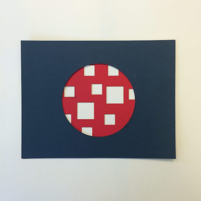
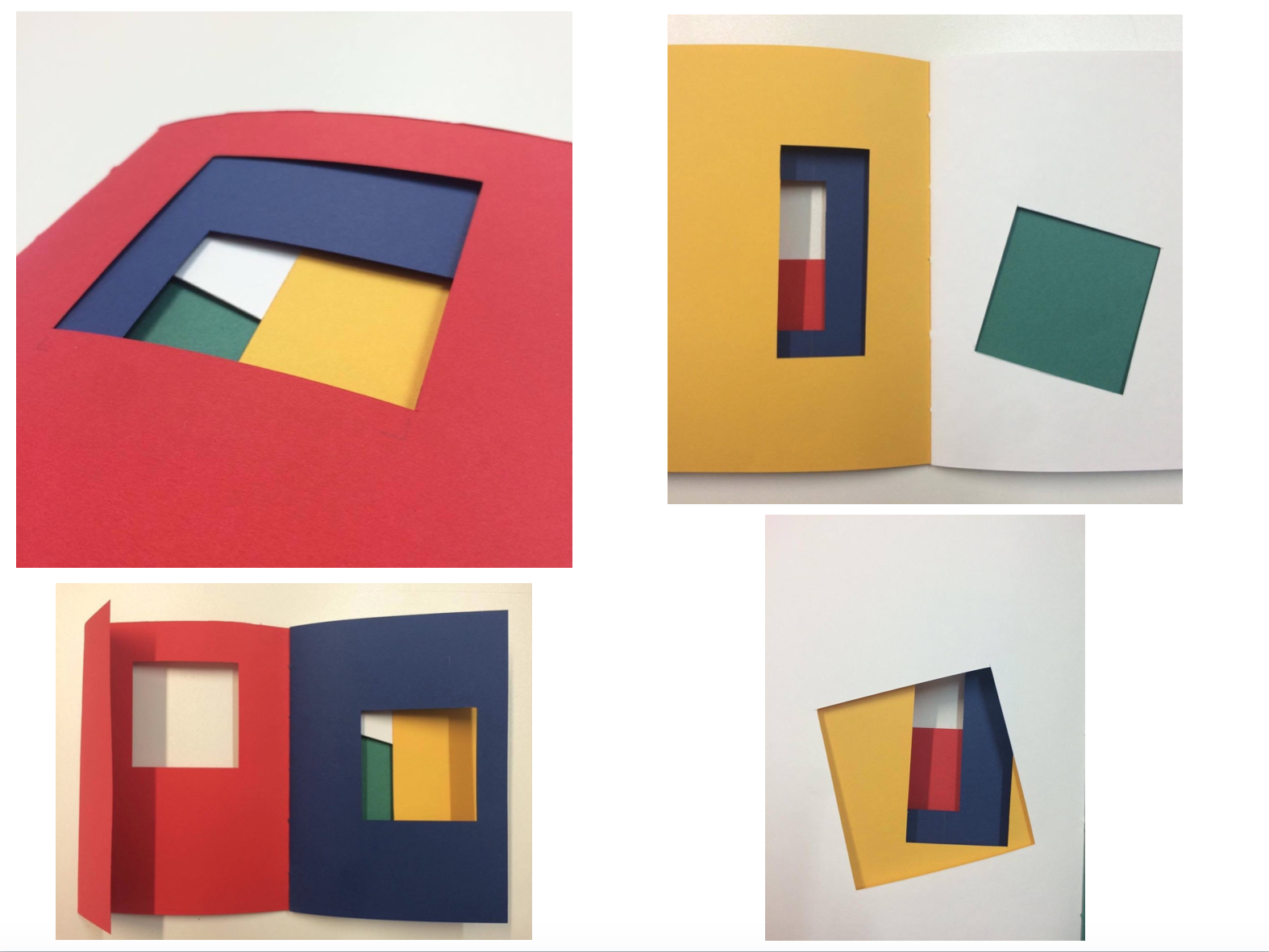
Design companies and studios get a lot emails and business cards everyday from designers wanting an internship or placement. In order for my notebook to stand out over the rest of the designers, I have decided to take advantage of the pages and cut into them to create an engaging and expressive cover.

Experimentation:
Wanted to use inspiration from the symbol I created because the geometric shapes and lines will translate well into this technique. This is an engaging way to add colour, rather than digitally printing out flat compositions.


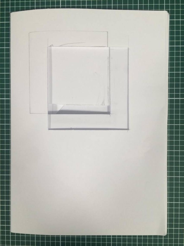
As my stock was expensive I used plain A4 paper to work out how I can make my cover as engaging and impactful as I can.


When the notebook is opened the target audience will see how I have used negative space to combine colours and shapes harmoniously. This will make the client see how innovative and expressive I can be with a simple notebook.


I created a margin by enlarging the cover which holds together the pages that create the layered effect. This makes the notebook practical as the owner won't have to flick through 4-5 pages before getting to the white, blank pages:

LETTERPRESS CONCEPT
To add typographic content I aim to use letterpress to set the type and then print directly into my publication. I will need to make sure I align the page with the text accurately. This adds another analogue technique.
Repeated my name using demo letter press:

Repeated my name and faded it out which will make my name memorable but it also takes advantage of the printing technique, making my publication more engaging.
Using another analogue process will reflect my style of practice to the client as they'll be able to see the print texture. This will look more personal and takes advantage of different techniques and processes, instead of limiting myself on Illustrator or Photoshop.


Printing straight into my publication was a mistake because I didn't press it properly as I was too conscious of making a mess of the book. In the end I still managed to make a mess of the book. This is all part of the learning process as mistakes provide better experiences, especially at this stage of my design journey.
SIZE
For the size of the publication, I looked at notebooks in shops and noted down a range of sizes that I thought would be appropriate and nice to work with. I only chose portrait publications because it's traditional.
14.5x21cm
9x12.5cm
17x23cm
I liked the size of the 17x23cm notebook because it had more room on the pages, however I think it will be too big to carry around, especially if I hand it to a potential client. Decided on 14.5x21cm because it leaves enough room for note taking and also sketches which will be appropriate for my target audience. It is also just an A4 page folded in half which will make my notebook cheaper and easier to reproduce.
(I may need to add on 0.5cm - 1cm to compensate for the fold)
STOCK
Gsm of stock can't be too large otherwise the pages won't fold completely and the publication won't stay closed. I used influences from my research into publications and visiting shops such as Village to choose the stock. Around 120gsm will be appropriate because it's thin enough to fold and bend yet still feels tactile and quality. A slightly textured paper can make my notebook even more tactile and benefit the target audience when sketching/painting.
Visited Fred Aldous to look for stock and found a large range of G.S Smith stock. The variety of colours and weights make the shop convenient for any brief. I chose a range of primary colours because I want to create simple, friendly and complimentary colour schemes inspired by my Design Principles - Studio Brief 01:


Design companies and studios get a lot emails and business cards everyday from designers wanting an internship or placement. In order for my notebook to stand out over the rest of the designers, I have decided to take advantage of the pages and cut into them to create an engaging and expressive cover.

Experimentation:
Wanted to use inspiration from the symbol I created because the geometric shapes and lines will translate well into this technique. This is an engaging way to add colour, rather than digitally printing out flat compositions.


As my stock was expensive I used plain A4 paper to work out how I can make my cover as engaging and impactful as I can.


When the notebook is opened the target audience will see how I have used negative space to combine colours and shapes harmoniously. This will make the client see how innovative and expressive I can be with a simple notebook.


I created a margin by enlarging the cover which holds together the pages that create the layered effect. This makes the notebook practical as the owner won't have to flick through 4-5 pages before getting to the white, blank pages:

LETTERPRESS CONCEPT
To add typographic content I aim to use letterpress to set the type and then print directly into my publication. I will need to make sure I align the page with the text accurately. This adds another analogue technique.
Repeated my name using demo letter press:

Repeated my name and faded it out which will make my name memorable but it also takes advantage of the printing technique, making my publication more engaging.
Using another analogue process will reflect my style of practice to the client as they'll be able to see the print texture. This will look more personal and takes advantage of different techniques and processes, instead of limiting myself on Illustrator or Photoshop.
I had already stitched my publication together which meant I had a very narrow window between the margin and the next page.
Needed to be clean and clinical so created a registration sheet. This was influenced by my screen print induction.

Provided my name and contact information:

Chose Clarendon 18pt because it's a traditional serif typeface that prints consistently - This is appropriate for the traditional analogue technique.

Printing straight into my publication was a mistake because I didn't press it properly as I was too conscious of making a mess of the book. In the end I still managed to make a mess of the book. This is all part of the learning process as mistakes provide better experiences, especially at this stage of my design journey.
Saturday, 12 March 2016
PPP Presentation 1.1
Stefan Sagmeister: Happiness by design
https://www.ted.com/talks/stefan_sagmeister_shares_happy_design?language=en


Watched Sagmeister's short talk from the TED archives to help me with the presentation. Noticed that he uses visual cues on his slides to keep the attention away from him which will help me as I often get nervous before presenting. He speaks very slowly and takes his time throughout the presentation. This makes the information easy to digest for the audience and stops Sagmeister tripping over his words.
Sagmeister also uses humour to relate to the audience and bring them on his side. This makes everyone, especially the speaker, more comfortable. He isn't hiding behind the laptop which shows he's comfortable and also makes the audience feel like he wants to be there. This is important for gaining all of the audiences attention.
The structure of Sagmeister's presentation is well practiced because he introduces a subject which intrigues the audience and then shows the slide with imagery that relates to his previous point. This makes the presentation more engaging because the audience is anticipating the next slide.
I aim to make my presentation visual because it's a useful technique that engages the audience and stops everyone looking at me which is intimidating. Sagmeister had a 15 minute time slot which he filled comfortably as he chose happiness as the subject to focus on. My presentation is half the length of Sagmeister's which means I need to be concise and stick to a time plan.
PPP Presentation 1.0
Produce and present a 7 minute Powerpoint/pdf presentation that communicates a reflective summary of your experiences on the course to date. You should aim to reflect on who you are as a learner and a designer as well as how the things you have experienced over the past nine months have affected your current aims and ambitions.
Preparation and Considerations
Previous Art/Experience?
Preparation and Considerations
Previous Art/Experience?
- Sixth Form
- Bath College
How has this developed me as a person/designer?
- Practical
- Conceptual
- Expressive
- Engaging
- Broad range of skills and processes
- Allowed me to specialise in graphic design
Travelling
- Copenhagen
- Amsterdam
- Venice
Inspired me to go into a creative industry and find an artistic style that I like:
- Matisse
- Rothko
- Pollock
- Sue Doeksin
Magazines
- PYLOT because it's analogue
Music
Music Videos
Pixies - Blue Eyed Hex
Band art/Album art
Festivals
What have you learnt?
- A lot about typography
- Grids
- Illustrator
- Time management
- Better printing techniques
- Typesetting
What do you want to learn?
- Editorial
- More binding techniques
- Create opportunity for myself
- Get my work into the world
- Collaborate
What mistakes have you made and how have you learned from them?
- As soon as I am set a brief I used to immediately resort to my laptop to create digital outcomes because I wanted to have something to show. I realised that I shouldn't be creating work during the early stages - I have started to stay away from my laptop and resort to pen and paper because I find it builds my concepts to make my work appropriate and to a better standard.
- Colour palette - Struggle to find colour schemes that work. However I am starting to use colours from other artists compositions that I like.
- Typography - Wasn't confident with choosing a typeface that is relevant for the task. However my knowledge of typography is growing and I am beginning to recognise different fonts.
- Narrowing down my concepts to one final
How will this affect your future development?
- Making mistakes is positive
What are your strengths and how have you/will you develop them further?
- Generating concepts
- Printing
- Analogue
- Proud of being proactive and booking my own inductions - laser cutting
What are your weaknesses and how do you intend to address these?
- Adobe - Keep using it and I will learn more with experience. Also using Youtube tutorials is useful.
What have you enjoyed?
- Book binding
- Screen printing
- Monoprinting
- Photography Studio induction
- Laser Cutting
What have you disliked and why?
- Wayfinding
- Public Information Leaflet
How does this affect your ambitions?
- Don't want to design for corporate identities because I find it creatively draining
- Although I may not like the brief I have started to make it personal to my creative style which makes the brief more engaging which results in a better outcome.
What did you want to get from the year?
- Have a better understanding of the direction I would like to specialise in
- Develop all techniques
- Learn new processes - Be more confident with screen print, photography
- Start to work 3D
- Think more contemporary and subjective when appropriate
- Become more familiar with the colleges facilities
Have you achieved this?
- More confident with Illustrator and InDesign due to workshops and practice
- Gained a passion for analogue techniques
- Been proactive and moved away from my laptop to use print/laser cutting.
- Pagination is more complicated than I originally thought
- More interest in typography
- Favour analogue process still
- Trust myself
Sunday, 6 March 2016
Analogue and Digital
Found an interesting blog post by Robert Urquhart about print media in the digital age. This article is relevant to me because I am currently writing an essay on the subject as well as gaining a passion for analogue techniques such as traditional print.
The article provides quotes from practicing artists and studios that use traditional print methods so I researched into them further to gain a better understanding of their style of work. These could be clients that I can contact in the future.


Mather has documented his work well on his website as it is predominantly visual so the audience can see how tactile his prints are. This is another example of how professional photography is beneficial.
Mather's array of contemporary prints are well considered, especially when choosing the amount of colours/layers that are required. He effectively combines text and image but makes it engaging for the audience due to patterns.
Caspar Williamson is a an image maker and illustrator based in London. Recognition from the screen printing community has led to invitations to partake in a number of the UK’s most highly regarded exhibitions.


Low Tech Print profiles more than 100 studios and creatives using traditional print methods. The book is divided into four chapters: screen printing, letterpress, relief printing and other methods. Each chapter includes a step by step guide to the technique, a brief history of its development, and an in-depth look at a particular method within that craft.

Print Club London was established in 2007 and is run by managing director Fred Higginson (Sculptor/ Illustrator M.O.L.) and director Kate Higginson. The studio is open for any member to use 24/7 with an array of top quality equipment such as Macs, exposure units and an array of screen beds. Members have to pay £100 a month to use the facility which is expensive, however it would be extremely beneficial as I'd be working in a creative, analogue environment. It also states that you must be familiar with the equipment so I would need to gain more experience with screen printing. There are also workshops which they recommend.
Patrick Concepción


There are hundreds of artists and members pages on the website.
Kate, Director Print Club London:
"We see young graduates thinking about design as a business. Be good at design but also be better at selling your own brand and marketing yourself. Expose your work to a world outside of the creative sector which is really key in expanding what we all do."

The article provides quotes from practicing artists and studios that use traditional print methods so I researched into them further to gain a better understanding of their style of work. These could be clients that I can contact in the future.
Dan Mather
"When printing in a shared studio, for me, there is a noticeable difference between those who are designers printing for themselves and those more on the side of commercial printing. Experimentation is vital to the development of a solid portfolio, understanding and confidence in the the process of silkscreen. A sense of ownership is a part of a design and print occupation."
I will take this on board as I want to experiment with more techniques and concepts to create contemporary graphics.


Mather has documented his work well on his website as it is predominantly visual so the audience can see how tactile his prints are. This is another example of how professional photography is beneficial.
Mather's array of contemporary prints are well considered, especially when choosing the amount of colours/layers that are required. He effectively combines text and image but makes it engaging for the audience due to patterns.
Caspar Williamson
Caspar Williamson is a an image maker and illustrator based in London. Recognition from the screen printing community has led to invitations to partake in a number of the UK’s most highly regarded exhibitions.
"It is easier to sell artwork if it is marketed. I think a lot of people have seen the way artists such as Banksy have skyrocketed-- £50 screeenprints suddenly appearing for £10,000 in auction and the buzz that is created around artists and designers that become the 'it girls/boys' of the art world. Lots of auction houses, art fairs and art agents have seen this happen and are on the hunt for 'the next big thing' constantly. However I think the overall outcome from the current wave of 'graphic design celebrities' is ultimately a positive one, as it pushes people to be come up with continually more creative and original work if you don't want to simply be written of as a rip-off or copy-cat."

Williamson has made a big influence in the screen printing community:
F L Y I N G M A C H I N E S
Caspar created FLYINGMACHINES which is a design, illustration and art direction company based in London. Recent projects have included packaging and merchandise for independent and major record labels such as Universal Records, EMI and Rough Trade, as well as large-scale interior graphics for Spotify, Samsung and MTV.

Williamson has also written two publications about screenprinting and I think 'Low Tech Print' will be a useful publication to read because it will provide me with a range of printing techniques that I can do with limited budget:

Flyingmachines also have a blog so I can keep up to date with a personal angle of the studio: http://flyingmachines-uk.blogspot.co.uk/
Williamson is also part of Print Club London:

Print Club London is a great source for finding other artists and designers. There website hosts each one and provides examples of their work. I will return to the site to gain more inspiration and find artists such as:

Joe Cruz

Pleased that I have found some websites and studios that are updated regularly so I can return to the site to gain inspiration and see what's going on in the print world.
"We see young graduates thinking about design as a business. Be good at design but also be better at selling your own brand and marketing yourself. Expose your work to a world outside of the creative sector which is really key in expanding what we all do."
This is a useful piece of advice because I tend to publish my work into the creative world which means it is critiqued a lot because the audience is already familiar with good design. If I was to share my work outside the creative sector more people may like it because they're not familiar with rules of design, etc.


Useful publication to talk about in my essay. The magazine consists of a contemporary, rule breaking layout, especially with typesetting. Some people may argue that this makes it disjointed and hard to read, however I think it makes the text easier to read and interpret because of the diverse size of type. I can use this publication to inspire my layout for future publications. People of Print's attitude towards creativity is positively similar to the way I interpret design.


Screen printing images makes them look vintage due to the grainy finish from the screen print. I could screen print my images into my notebook in order to get a textured and muted outcome:


They provide a one to one service from creation to completion so that the client leaves the studio with the highest quality edition and happy that everything has been tried and tested to reach the finished artwork. I like this attitude because having a one to one relationship with the client makes the outcome personal and they'll be likely to come back. Experimentation is a key element with JEALOUS and I think there working style is similar to mine. I would need to gain more experience with the screen printing but there is a high chance I will visit this studio in the future to get a feel for a working print studio.

Jennifer Mehigan
Ideas and brands don't plan for a legacy as much, I guess, and I think this is also largely related to the social media idea.

Publication:


Specific gestures: brush strokes, licks, screen swipes combine to form a fluid visual language that deconstructs desire, touch, and reality.
Inspires me to push the boundaries of techniques such as screen printing - Layering techniques
People of Print
Mehigan features on People of Print which is a unique creative community driven by an experienced force of art directors, project managers, graphic designers, illustrators, developers and printmakers across the globe.
As well as creating bespoke and high quality screen prints, they also create a magazine:

ELEMENT 003:


Useful publication to talk about in my essay. The magazine consists of a contemporary, rule breaking layout, especially with typesetting. Some people may argue that this makes it disjointed and hard to read, however I think it makes the text easier to read and interpret because of the diverse size of type. I can use this publication to inspire my layout for future publications. People of Print's attitude towards creativity is positively similar to the way I interpret design.
Kate Gibb


"I do feel that part of the success of the hand rendered approach also has to do with our current and past financial climate of the last few years. Not just an aesthetic change in culture and creative trends. Consumers have lost faith I guess and the hand rendered / craft approach emotes nostalgia, feels familiar and subtly instils a kind of trust from a product."


Illustrative style provides a lot of scope for graphic outcomes, especially if type was added. They would work well as posters or album covers:


'Bits and Bobs':
Soft, flowing texture created by analogue technique. This would be hard to replicate digitally.

Gibb is part of JEALOUS which is based in London and is one of the leading screen printers in the UK:

Christian Majonek - Guerilla Print

"Letterpress and other traditional printing techniques are manual processes that perfectly coexist with digital graphic design. In my opinion, the two can also inspire and profit from one another." - Agrees with the argument in my essay.
Carey Ellis

"Traditional screen printing goes hand in hand with fashion, and anyone involved with the industry will instantly see the unique craftsmanship that goes with screen printing that cannot be fulfilled by digital. I work with both techniques, but have more of an attachment to my work that i produce using screens because of the handmade element."
"I think many designers today use digital print as it is great for mass production, but the smaller more individual designers are keeping the traditions alive and ensuring that screen printing is still fashionable."
It is refreshing to see the original article because it opened up so many other connections into practicing print designers which will benefit me when I start using screen printing and other print mediums. It seems that although the digital age is still growing, there is still a space for traditional techniques and I think some of the artists have summarised that well in the blog post. It's a shame that almost all of the design studios are based in London. I'm not surprised by this, however it is a very expensive place to live.
The information that I have gathered from artists and designers website, especially their views and opinions on screen print in the digital age is relevant for my COP essay as it will provide more research content and quotes to support arguments.
I now feel a lot more confident with the direction I want to take my design from this year to second year because there is a huge backing for traditional printing technique, especially from the likes of People of Print, Print Club London and also JEALOUS.
Subscribe to:
Posts (Atom)