This year I have continued to explore and combine physical and tangible processes with digital. This experimental practice lead me to discover Dafi Kuhne who has been a massive influence on the module this year. Having to interview a creative was a daunting prospect however having the passion and knowledge about Kuhne and his techniques gave me confidence. I now feel a lot more confident to approach other professionals because of how beneficial their opinions and perspectives of design can be. Booking print/photography studio slots allowed me to get high quality images of my work so that it looks professional online. This is really important for my practice as my outcomes are predominantly physical and the high quality images supported my submissions for competition briefs.
I have an increased awareness of the importance of design for screen from OUGD504 because it made me aware that it is a medium that is here to stay and will keep on growing. It is important that I continue to increase my awareness and understanding of what is going on not just with print but screen as well. I have enjoyed bringing print into screen especially when responding to competition briefs because online videos reach a diverse audience when imbedded in social media. My experience in Berlin lead me to discover a project by Pathetic Sympathy Seekers which combines photography, collage and typography in a conceptual publication format. Combining physical, digital, analogue and photography together on screen is something I aim to explore as I move forward with my studies. I intend to continue improving my skills with the Adobe software, especially After Effects because moving image/graphics is more engaging.
I am really pleased that I managed to get a short placement with Extra Strong at the start of the year.
Reflecting on this experience, I have developed my digital skills which gives me confidence to go back and for a longer placement. Looking forward to third year, I am really keen to get a placement because I learnt valuable lessons at Extra Strong and the experience made me a better designer. I have identified some studios that I would like to contact, however they are from a diverse range of disciplines which doesn't show consistent vision as I am still unsure of what I want to be. Crack Magazine has an office in Bristol and I feel I am suited to working for them because I have an interest and understanding in the articles and topics (music, art, fashion) and their contemporary style really appeals to me. Working in an editorial context would be great for increasing my knowledge and understanding which I can transfer into my own practice.
The Collective was a really exciting brief because it provides opportunity to get my name and fellow students names into the real world. Combining all of our interviews into a publication was initiated by the fact that we all interviewed well established and recognised designers. Feedback supported the project and encouraged us to get it into the real world because they saw it had great potential and it will also be an opportunity to get some money for our design work. If we took it into production it would be a really great experience for the future because we will have to deal with external printers and commercial considerations in order to make sure it is printed to a high standard. Looking forward to third year, it would be great to get more work into the real world.
My research and discoveries of working with traditional letterpress (Dafi Kuhne, Nomad Letterpress, Winter) was an eye opener because it made me realise the complexities of the process and how much I need to learn. The processes and equipment are all very expensive to buy/rent and even workshops are too expensive/ To overcome this, I intend to get in contact with some letterpress studios and visit there studio and I may need to find a part time job to fund this travel and workshops. My interview with Dafi Kuhne, as well as listening to other creatives talk, made me aware that designers can't do what they want to do because, at the end of the day, they need to make an income. They often work in a studio in order to make money and self initiate projects on the side. Simon suggested looking into the 'artist in residence' scheme which would allow me to get the university facilities for free for an extra year in order to explore my personal interest and practice.
Technology and typographic manipulation is an area that I have identified an interest in, especially with the dark room techniques and processes because I feel there is great opportunity to combine the two. Due to the heavy workload this year, I didn't manage to get back into the dark room and experiment with ideas which is a shame because it would have supported this submission. Kuhne's advice however justifies this because he believes the concept can only be applied when appropriate, not just for the sake of it. I aim to find a purpose for the concept next year because I believe it has great potential.
Monday 8 May 2017
OUGD502 - Creative Report - Production 4
Test printed the outcome in order to check the hierarchy of the content and proof read the interview.
The publication starts with an image of Kuhne's work to put the audience into context. I decided to move the image of Kuhne's poster to the right page because it was showing through the front cover.

Having the second image means there are blank pages. I don't want to design something else for the sake of filling in a blank spread, therefor I removed the image.

The images of Dafi's work became problematic as I want to keep the page count small and focus the attention on the interview. Commercial realities would also require me to ask permission to publish Kuhne's work, therefor I made the decision to remove the images from the publication.
Type size
I have gained more of an understanding of Modernist design principles from COP which I have imbedded into my design.
Vignelli Canon:

'12 on 13, 14 on 16 for columns up to 140 mm.'
My column is 125mm therefor I set the type at 14pt - Increases legibility to avoid straining the readers eye.
Stock Choices
Wanted to explore the potential of print by experimenting with a range of stock choices for the cover. The yellow and off-white cream aim to make the publication more tangible and create contrast between the cover and the content. I explored fairly neutral colours so that the colour doesn't overpower the typography.
White
Yellow
Cream
All 125gsm to provide structure and protect the content.

Test Print
Cover:


Printing on the numerous stock demonstrates potential ways the interview can be distributed. The white stock increases legibility however it doesn't draw attention to the product. I chose to print on an off-white/cream stock because it is reminiscent of my old school reports which were often printed on a muted pastel colour. This ultimately adds authority and function as it is easy on the eye because of the softer contrast between the stock and the type. The yellow stock draws the audiences attention and the type is clearly legible.
Due to the small amount of pages, I printed on 125gsm white stock which gives the publication more structure.
Content:

My A3 prints can be folded in half and slotted inside the middle of the publication which will add desire to the product for consumers.


The monoprinted poster folded inside the publication could have been taken further as the graphic flack and inconsistencies of the analogue process contrasts nicely with the clean and crisp digital print out. Different quotes can be manually printed and slotted in throughout the outcome as a visual break from the text heavy interview. I found that this year I overcomplicated a lot of the briefs however for this outcome I made sure that I completed it objectively in order achieve function and clarity. I didn't mess around with the design too much and I found referring to Vignelli's Canon really beneficial for setting a large amount of type. This ultimately allowed me to speed up the decision making process. I have really enjoyed combining formalised design principles with autonomy which I am keen to imbed in my design process in the future. Knowing the rules of typography increases legibility and professionalism which has been a focus of this year and puts me in a good position for next year.
Final Decision:
Personally I would take the off-white stock into production because the muted tone of yellow doesn't strain the readers eye. The colour of the stock is also reminiscent of report cards which other creatives noticed through feedback.
ISSUU Publication:
I decided against printing an A2 Posterzine because the digital print facilities don't print double sided A2. I could have digitally printed the type and then screen printed the poster to overcome this, however I felt the content was very cramped and longwinded in an A2 format.
Saturday 6 May 2017
OUGD502 - Creative Report / Yeah Collective
As a response to the Life's-A-Pitch presentation and concept created from Yeah Collective.
Each member of the collective have managed to interview a well established design professional over a range of disciplines. The professionals names are well recognised in the design community so we thought it would be a great opportunity to combine these findings into a single publication.
It was highlighted from the presentation feedback that this was a great opportunity for distributing our work into the real world as designers and creatives would want to read it in order to gain knowledge about professionals practice and opinions on design.
There are other opportunities with this concept as numerous issues can be published on specific topics:
As a collective, we discussed the size of the publication:


Footprint's talk inspired us to consider risograph because it is a sustainable printing method. The unique finish and ability to print directly onto coloured stock creates a sense of DIY and raw media which takes advantage of the potential of print. Footprint encouraged us to get involved so this could be a really useful source.
Pica-Post 11: It's About Time is a zine by Oi Polloi. It gained a positive reception from the group as the width of the pages provide more space for the content.


Digitally Printed - Pressision Print
- Reliable
- Good quality
Retail Price
Each member of the collective have managed to interview a well established design professional over a range of disciplines. The professionals names are well recognised in the design community so we thought it would be a great opportunity to combine these findings into a single publication.
It was highlighted from the presentation feedback that this was a great opportunity for distributing our work into the real world as designers and creatives would want to read it in order to gain knowledge about professionals practice and opinions on design.
There are other opportunities with this concept as numerous issues can be published on specific topics:
- Design students - Opinions on design education and showcasing the work produced
- Print - Interview designers specifically within print
- Digital - Interview designers specifically within digital
- Art - Exploring artists practices in relation to design
- Music - Designers who create for music
There is also opportunity for having an exhibition to accompany the book launches. We can ask the designers to submit their work to the exhibition as well as bringing other creatives such as DJs, bands and workshops.
Target Audience
Designers
Students
People interested in design
Commercial Considerations
We would need to ask for the designers permission to publish the interview because they may be sensitive to how they are perceived. We would also need permission to publish their work within our outcome to avoid copywriting issues. At the very least we could just credit them within the publication.
Potential Formats
As a collective, we discussed the size of the publication:

Broadsheet/Newspaper
The format of a newspaper would be appropriate because the interviews are providing the audience with news and opinions from creatives which fulfills the traditional role of the newspaper.
Large scale
Cheap stock
Recyclable
I enquired with the college's digital print facilities and unfortunately they're unable to print broadsheet formats. Printing broadsheet newspapers are also very expensive, especially with a short print run therefor we looked at other options.
Zine
Cheap to produce and easily distributed
Small format
Considering the amount of content we have managed to get a zine could be a cramped format. Considering the content is actually relevant and useful, a more authoritative format would be more appropriate. Choosing a more expensive printing method will make us charge for the publication so that we gain a profit.
Printing Methods
Risograph -

Pica-Post 11: It's About Time is a zine by Oi Polloi. It gained a positive reception from the group as the width of the pages provide more space for the content.
Screen Print -
Obviously very time consuming process, however we can potentially screen print the cover to allow us all to contribute.
As we all have a range of styles and influences, we can potentially create a cover each (or in pairs) and distribute them in a number of editions. This will showcase our original styles and add desire to the publication because the audience can choose a cover of their choice. This was influenced by my the latest issue of 'The Art Form':
Four different covers, each is limited to 300 copies:


Digitally Printed - Pressision Print
- Reliable
- Good quality
Retail Price
Price depending on the printing cost - £15-20?
Mock up
Sammy mocked up a publication concept combining all of the interviews:

Back:

As a Collective we are really keen to set this up and get it published because we are confident it will get a positive reception. The content is informative and relevant as it covers topics over print and screen and has potential to explore many more. It will be a great way to get our names out into the real world which will be great exposure.
Sammy mocked up a publication concept combining all of the interviews:
Front:

Back:

As a Collective we are really keen to set this up and get it published because we are confident it will get a positive reception. The content is informative and relevant as it covers topics over print and screen and has potential to explore many more. It will be a great way to get our names out into the real world which will be great exposure.
OUGD502 - Creative Report - Production 3
Two potential outcomes:
A2 Double-Sided Poster


Production Methods:
Decided against screen printing the outcome because the finish is almost too perfect, especially when printing large typography. I aim for the poster to be reminiscent of the hands on, raw printing processes that Kuhne explores so I looked at other options such as letter press and monoprint. Unfortunately I couldn't get hold of any large point Helvetica woodtype so I resorted to monoprinting the outcome because it is a process that encourages one to work autonomously as there are so many adaptions to the process.
Process:
Using a scalpel and a ruler allowed me to cut the straight lines accurately however the curves were cut free-hand. I made sure that I kept the counter cut out from the a, o, p and r to add to the printing plate just before printing. Laser cutting the text would have allowed me to be more consistent and accurate, however I have enough time to manually cut the type. In the future, I would like to explore laser cutting type from wood/card because it will provide me with more opportunity to manually print and take control of a variety of type styles.
My experience with monoprinting reminded me to lay the stencil backwards so that the relief print would be the correct way.


Outcome:


Using the letters cutout from the original composition, I organised them randomly over the composition. The fact that I had to set the type backwards was hard to get my head around, however the autonomous approach creates a playful and naive composition.
Positive and negative:


Rolled the printing plate with ink and blanched it with a piece of scrunched up tissue paper. I then sent the type through the press with the inked up plate:
Black on black:

The naivety of the typesetting contrasts nicely with the statement.

A2 Double-Sided Poster

Unfortunately the digital print facilities at the college don't print double sided A2, therefor I won't be able to print the poster on the other side. I could print it on A3, however the type would be too small and confined making it uncomfortable to read.
Feedback and reflection:
The crit group suggested that the poster concept would be more appropriate as it is Kuhne's main practice. A poster will also allow me to create a composition inspired by Kuhne's practice.
Due to the fact the print facilities don't provide double sided A2, I intend to resort back to the booklet concept
Booklet:


Poster
As Dafi is renowned for his poster work, I feel this would accompany the zine nicely and can even be embedded into the posterzine concept if I decide to take that forward.
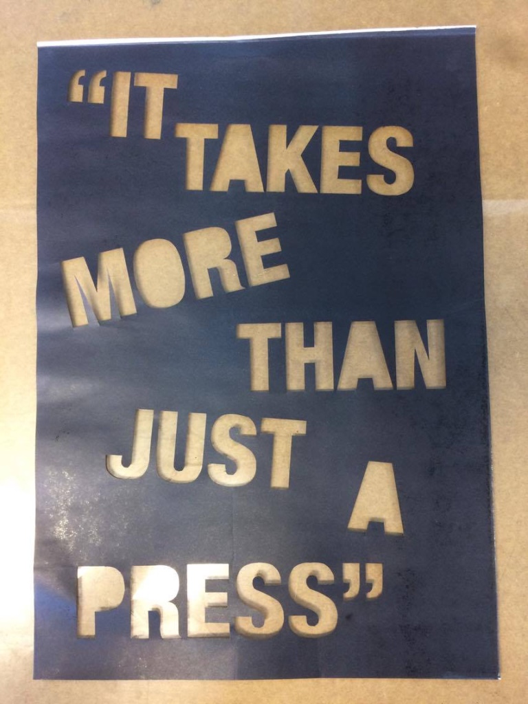
Took one of the quotes highlighted within the text, 'It takes more than just a press' which is an umbrella statement for the whole of the interview.
Throughout the interview I asked Kuhne about his design process and I was really intrigued by how he starts a project. Kuhne said that he works digitally with Helvetica Bold Condensed in order to plan out each typographical element, therefore I used this typeface throughout my experimentation.
Experimented with typesetting inspired by Kuhne as he often sets the type at angles to create movement and take advantage of all the available space. As Kuhne is known for working autonomously, I set the type as if it was still in the process of being composed on the print bed.


Production Methods:
Decided against screen printing the outcome because the finish is almost too perfect, especially when printing large typography. I aim for the poster to be reminiscent of the hands on, raw printing processes that Kuhne explores so I looked at other options such as letter press and monoprint. Unfortunately I couldn't get hold of any large point Helvetica woodtype so I resorted to monoprinting the outcome because it is a process that encourages one to work autonomously as there are so many adaptions to the process.
Process:
Using a scalpel and a ruler allowed me to cut the straight lines accurately however the curves were cut free-hand. I made sure that I kept the counter cut out from the a, o, p and r to add to the printing plate just before printing. Laser cutting the text would have allowed me to be more consistent and accurate, however I have enough time to manually cut the type. In the future, I would like to explore laser cutting type from wood/card because it will provide me with more opportunity to manually print and take control of a variety of type styles.
My experience with monoprinting reminded me to lay the stencil backwards so that the relief print would be the correct way.

Outcome:


I ran the printing plate back through the press to get a negative of the composition:


Using the letters cutout from the original composition, I organised them randomly over the composition. The fact that I had to set the type backwards was hard to get my head around, however the autonomous approach creates a playful and naive composition.
Positive and negative:


Rolled the printing plate with ink and blanched it with a piece of scrunched up tissue paper. I then sent the type through the press with the inked up plate:
Black on black:

The naivety of the typesetting contrasts nicely with the statement.
Final Decision:
Decided against the pure white composition because I want to pick up the imperfections of print to reflect Kuhne's raw, physical and tangible method of working.

Whilst I gained a lot of positive feedback for the negative compositions, I felt like the outcome needed to be clear and succinct in order to gain high impact.
It was unfortunate that I was unable to print the poster using Kuhne's traditional printing methods, however I didn't have the facilities.
OUGD502 - Creative Report - Production 2
Having decided to remove the final thoughts on Kuhne's summer program, I decided to include it in the final outcome because it offers an honest justification for the high price bracket and informs the reader that Switzerland is expensive.
Book format:


Made sure that I adjusted the typesetting to remove any widows and orphans, demonstrating the skills that I have developed this year.
Add the titles to Kuhne's work that I have published.
Cover Concepts
1 - Simple and minimal colour scheme inspired by MB Grid Systems publication. The cover aims to be neutral in order to keep the focus on the content:

2- Took a quote from the interview, '20 tonnes of type' in order to title the essay. I enlarged the type and set it at the bottom of the composition in order to show its weight through type.

Transferred the title into the neutral composition.

Feedback:
From the feedback I can confirm that the minimal composition is the better option because it focuses the audiences attention on the content. It was highlighted that 'Dafi Kuhne' should be more prominent because designers will recognise it.
Final Composition:
Demonstrated competent typesetting skills in a formal layout to give my report more authority and increased legibility.

OUGD502 - Life's a Pitch - Yeah Collective
Definition: An artist collective is an initiative that is the result of a group of artists working together, usually under their own management, towards shared aims.
6 graphic designers living together.. We took the opportunity to create a collective for the Love Triangle exhibition to allow us to showcase our individual styles. Reflecting on the interview stage of PPP, we have all managed to interview well established designers from a range of creative backgrounds.
We began by creating a collective name.
After being exposed to Goat Collective throughout first year this helped to inform a friendly, independent, less serious tone of voice. To begin with we were all very indecisive of the names after brainstorming a range of ideas. We focused mainly on single words to accompany 'collective' to make it memorable. Suggested a name based on the surnames of every member:
Harland
Harpin
Hastie
Humphries
Crowther
Green
Taking inspiration from mathematics:
H4CG - However it was received as too serious
'Yeah' was also a high contender due to its simplicity and vernacular language.
I suggested we all write down three names to submit into the voting system in order to establish a few names to narrow the scope.

Bind
Common
Fuse
Combing forces:
The idea behind the names I submitted were predominantly influenced by the fact all of the members have come from different backgrounds and take influences and skills from different places and we are combing forces to increase potential and distribution.
After much debate, we decided to stick with 'Yeah.' due to its simplicity.
Promotional Video
Michael volunteered to create a short promotional video that can be used at the start of the presentation to introduce each member of the collective. This also provides a great ice breaker.
Created a presentation to pitch our collective and define our aims. Intro:

Pretty much half and half split between the North and South which shows how we can gather a range of influences to encourage diversity. Addition of 'Singapore Island' replaces The Isle of White to add humour and engage the audience.

Examples of the diverse range of styles and skills that we bring to the collective we all selected work that represents our practice. Editorial, collage, poster, user experience/interface design and animation:

As a response to Studio Brief 02 we thought that we could combine our interviews into a publication. Each member of the collective have interviewed an established designer across print and digital. This would allow us to combine our knowledge and skills.
The target audience for the publication would be designers, design students and people interested in contemporary visual culture.


Connor mocked up of a potential zine cover design:

I applied Connors cover onto a mockup zine and altered the colour mode to duotone to make it look like it was printed on a risograph/photocopier onto coloured stock. If we were to take this forward, I would suggest a neutral, minimal cover to allow the content to showcase our diverse styles.

The publication provides us with the chance to showcase our design skills whilst informing genuine recent knowledge about leading professionals in the design world.
Distribution:
Our target audience will be culturally engaged young people and designers. We intend to place the free publication in a variety of locations around Leeds that attract this audience:


If we could manage to get funding it would be great distribute the zines our to these locations for free, however if we took it into our own hands we would have to charge for them. If we were to take things forward we would make sure that we contact the professionals that have been interviewed and ask for their permission to publish what they say.
Taking advantage of the Universities facilities to save money and it would allow us to use digital and analogue processes.

Another addition of humour and ask for questions:

6 graphic designers living together.. We took the opportunity to create a collective for the Love Triangle exhibition to allow us to showcase our individual styles. Reflecting on the interview stage of PPP, we have all managed to interview well established designers from a range of creative backgrounds.
We began by creating a collective name.
After being exposed to Goat Collective throughout first year this helped to inform a friendly, independent, less serious tone of voice. To begin with we were all very indecisive of the names after brainstorming a range of ideas. We focused mainly on single words to accompany 'collective' to make it memorable. Suggested a name based on the surnames of every member:
Harland
Harpin
Hastie
Humphries
Crowther
Green
Taking inspiration from mathematics:
H4CG - However it was received as too serious
'Yeah' was also a high contender due to its simplicity and vernacular language.
I suggested we all write down three names to submit into the voting system in order to establish a few names to narrow the scope.

Bind
Common
Fuse
Combing forces:
The idea behind the names I submitted were predominantly influenced by the fact all of the members have come from different backgrounds and take influences and skills from different places and we are combing forces to increase potential and distribution.
After much debate, we decided to stick with 'Yeah.' due to its simplicity.
Promotional Video
Michael volunteered to create a short promotional video that can be used at the start of the presentation to introduce each member of the collective. This also provides a great ice breaker.
Created a presentation to pitch our collective and define our aims. Intro:

Pretty much half and half split between the North and South which shows how we can gather a range of influences to encourage diversity. Addition of 'Singapore Island' replaces The Isle of White to add humour and engage the audience.

Examples of the diverse range of styles and skills that we bring to the collective we all selected work that represents our practice. Editorial, collage, poster, user experience/interface design and animation:

As a response to Studio Brief 02 we thought that we could combine our interviews into a publication. Each member of the collective have interviewed an established designer across print and digital. This would allow us to combine our knowledge and skills.
The target audience for the publication would be designers, design students and people interested in contemporary visual culture.


Connor mocked up of a potential zine cover design:

I applied Connors cover onto a mockup zine and altered the colour mode to duotone to make it look like it was printed on a risograph/photocopier onto coloured stock. If we were to take this forward, I would suggest a neutral, minimal cover to allow the content to showcase our diverse styles.

The publication provides us with the chance to showcase our design skills whilst informing genuine recent knowledge about leading professionals in the design world.
Distribution:
Our target audience will be culturally engaged young people and designers. We intend to place the free publication in a variety of locations around Leeds that attract this audience:


If we could manage to get funding it would be great distribute the zines our to these locations for free, however if we took it into our own hands we would have to charge for them. If we were to take things forward we would make sure that we contact the professionals that have been interviewed and ask for their permission to publish what they say.

Another addition of humour and ask for questions:

Subscribe to:
Posts (Atom)