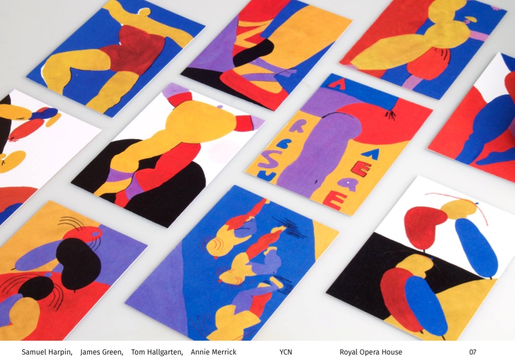
Working collaboratively was a great opportunity to experience working within a creative team. I really enjoyed the process because it allowed a range of styles and inspiration to come together. The group that I was involved with was extremely productive and we were lucky that we all shared a style which made transforming our concepts into outcomes an enjoyable process. The outcome is definitely the most developed and well executed project so far because working as a group allowed us to share responsibilities and ultimately get more done. The concept has transferred well over the numerous deliverables which shows how informed our concept was. My time management throughout this particular project was good, however balancing and struggling with the workload with other competition briefs made it hard for me to mock up my ideas so it is fair enough that some of my designs weren't considered. In the future, I intend to be more practical to avoid this. I would like to work for a cultural context again in the future because their is room for a lot of influence to be taken on the art form and imbedded into the outcome.
I would really like to work with creatives from other disciplines in the future because
Wolfgang Weingart is an internationally renowned graphic designer and typographer. His work is categorised as Swiss typography and he is credited as "the father" of New Wave or Swiss Punk typography. Weingart strongly believes that one must know the rules in order to break them which is encouraging me to research into design principles and imbed this into my work.
Weingart is also a teacher and his deconstructive style was picked up by many of his students, distributing it around the world.
In an interview with Eye magazine, it became apparent that this movement of typographic experimentation was already in full swing before the introduction of the Macintosh, however this technology ultimately speeded up the manual process.
I find it really inspiring how Weingart questions the role of typography for an artistic context. The cropping and layering of a variety of typographic forms creates intriguing negative space that which remind me of architecture.
Interview with Weingart:
Published his book not just to showcase the work he has created, but to show why and where the inspiration came from. This would be a great source for me to get hold of because I am intrigued by the meaning and justification for breaking typographic rules. Not just doing it for the sake of it.
He is a doer rather than a thinker
Dropped a case full of type. Instead of putting the type back into the case, Weingart decided to have fun by setting the type that had fallen out into a circle held together by a piece of cardboard.
Juxtaposed the compositions with images from his travels:
Weingart compares a lot of his typographic prints to nature and other objects which became evident again when he explores the use of line:
Weingart's exploration of line reminded him of the desert:
Juxtaposed the composition with the photographs - I like how Weingart combines two completely different subjects and processes which are often aesthetically complimentary.
Bending metal
Weingart's experimental practice was laughed at by his colleagues. Considering how successful and influential he has been on the forming of contemporary visual culture, it shows how doing something different and exploring subjects and areas of practice that others reject can be successful.
A middle axis
'A middle axis does not correspond to my taste. Nor do the elements of decoration'
Working with a middle axis is limiting because the content only flows from top to bottom and doesn't consider left and right. Weingart prefers asymmetry because the lack of symmetry offers a lot more possibilities.
Moving away from the middle axis, to me, shows when contemporary visual culture began.
Weingart doesn't use a grid which was pleasantly surprising. He believes 'a grid forces me in a cage. I can not move backwards, forwards, up or down. There's always an end.' I can relate to this, however at my stage in my design education I believe the grid can benefit me as it aids organisation and consistency.
He wanted to change this because the rigid typography could not be developed.
Liked to work with Akzidenz-Grotesk - Found Univers too complicated
Lithographic Film
Looked for new ways and possibilities of expression.
Used a hanky to create the Matterhorn for the cover of his book.
Scrunched it up and the scanned it. - Numerous scans and compositions were collaged together:
Used a paper view finder to crop the composition and find a section that looks like the Matterhorn. Layering film and collage
Combining physical manipulations with photographic technology is something that I like to do. I take my prints, scan them and then digitally manipulate to create new compositions. I really like this autonomous way of working and it is encouraging to see Weingart pursuing it.
The colour was a 'huge surprise. You cant anticipate that' - Outcomes to design don't need to be planned out and formalised. Working autonomously and experimenting with techniques and processes is key to pushing the boundaries to which I aim to imbed into my practice.
I have been really inspired by the work Weingart creates as his approach is exciting and innovative. The aesthetics of his work really appeals to me which I aim to explore with manual processes such as print. Looking at other materials and technology such as film and the photocopier is a new way to broaden my practice.
During my experience at p98a, I printed a typographic poster that had been set using traditional typesetting principles:
Gallery p98a is owned by Erik Spiekermann, a world-leading authority on typography and design who has shaped the world of typography as we know it. The composition is clear and legible however I aim to deconstruct it digitally ask:
How far can typography be deconstructed before it loses all meaning?
What can digital do for print?
Breaking typesetting rules
Layering and stretching the type taken directly from the scan:
Reorganised the typesetting as if it was still on the press. The size of the type and all elements of the composition are exactly the same as the original. I worked on these composition autonomously by moving elements around in order to make the composition legible but also use up the available space.
Personal projects are something that I aim to work on over the summer and through to next year. I think of concepts and experiments that aren't appropriate for a brief, however it is important to exercise my right as a designer and explore personal projects. Hopefully these experiences and outcomes will make me a well rounded designer to which I can transfer my skills and knowledge into appropriate contexts.
Nomad Letterpress
Whittington Press
nr Cheltenham
Gloucestershire
GL54 4HF
Nomad Letterpress was established by Pat Randle in 2011 in order to specialise in limited edition, fine press book work whilst harnessing the enormous creative potential of printing from lead and wood type. They are dedicated to continuing a tradition of fine letterpress printing, exemplified both by the high quality of work carried out for clients and in the training of a new generation of letterpress printers.
Near my home town:
The fact that Nomad are conscious of a 'new generation' of letterpress printers could provide a potential location to broaden my skills and technical knowledge on letterpress printing. The studios description and rationale is complimentary of my practice because they want to see realise the potential of traditional print methods in the digital age. It is encouraging to find studios that share the same objectives and aims.
Printing presses:
Fag Swiss Proof 40 (maximum sheet size: 405 x 580mm)
Fag Swiss Proof 52 (520 x 720mm)
Western A-Bed (20″ x 28″)
Heidelberg Platen (10″ x 15″)
Heidelberg Cylinder SBB (photo, 22″ x 30″)
Farley (12″ x 18″)
Albion (14″ x 18″)
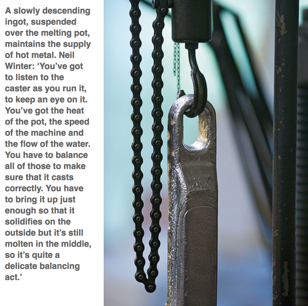
I lack experience with this equipment therefore it would be a really beneficial if I gain some practical experience before contacting the studio for a work placement. Neil Winter currently operates the three Monotype composition casters. Clearly a very technical job where experience is key to being successful:
'The accuracy with which type is cast is critical in giving the right flavour to any work; squareness of type body, alignment of face, clarity of casting, closeness and regularity of word spacing, correct hyphenation are a few of the requirements the Monotype operator needs to coax from a machine of immense complexity and subtlety, achieved in part by the correct balance of machine speed, metal temperature, water cooling and compressed air supply. Once a job has been completed the type goes back in to the melting pot and the process of recasting begins, meaning that we are always printing from freshly cast type.'
It made me even more aware of the technical process and the important role that Neil Winter plays:
I am really interested in the physical process of creating type from scratch and the fact that the type can be melted back down a recast makes it an ever evolving process. There is definitely more to typesetting than I previously envisioned. I prefer to work manually because it allows me to gain a better understanding of the process so learning these skills will also benefit me when typesetting digitally.
Letterpress Jargon:
Researched into some of the jargon associated with letterpress so that I can gain technical vocabulary:
Reglet: A thin strip of wood or metal used to separate type.
Ingot: A block of steel, gold, silver, or other metal, typically oblong in shape. This is slowly melted down and poured into the text caster.
Ligature: Two or more letters are joined together to form one glyph or character. Definition: Two or more letters combined into one character make a ligature. In typography some ligatures represent specific sounds or words such as the AE or æ diphthong ligature.
The fact that they're looking for a new generation of letterpress printers is encouraging because it provides potential for me to get in contact with Nomad and see if they have any schemes or workshops that I can attend to get involved.
Whittington Press
Alongside Nomad Letterpress is The Whittington Press which Neil Winter also works for. The presses share the same location. Winter was involved in the production of Double Dagger, where he cast the type through a Monotype composition caster and printed the letterpress through a Heidelberg Cylinder.
Double Dagger explores established designers views and opinions on what excites them about printing with hot metal type. Winter has printed the entire 12 page broadsheet using traditional letterpress which celebrates the old medium in a contemporary context.
Getting in contact with Double Dagger and asking them about the project and working with a letterpress studio will be really beneficial and I will gain some more contacts.
The Studio has an open day where anyone and everyone can visit the studio, take a look around and browse through stalls of printed materials. The event is on the first weekend on September every year and the fact that it isn't too far away from me means that I am likely to attend.